— DEFINITION
Full Identity Development
Just like humans, brands too have identities derived upon an emotional connection that serves as a reflection of the manner in which the brand is positioned and the desired image in mind. This process consists of an analytical mechanism whereby the needs of the business are aligned with the identity through marketing communication and its pieces.
This is another instance where we rile up our creative juices. Our creatives brainstorm the branding through typographies and sketches, aiming to bring the brand to life.
Several designs and logos are developed which our teams feel may sit well with the company’s identity. These designs are taken forth and finalized through a consensual process whereby each member is satisfied with the outcome. We seek to ensure that the 3 to 5 logo suggestions that we deliver are closest to your brand message and concepts so that the company can immediately resonate with the target audiences.
Here are some key elements identity design and development
Clear brand purpose and positioning
The first part of establishing a brand identity is determining what your purpose and positioning is. The brand purpose is the big reason for your existence. Brand positioning is the naming of who your product is for and why your product is a better option than the competitors. Defining these will inform your strategy as you create a logo, decide on a color palette, etc. A process called Purpose, Position and Personality is useful for answering these questions.
Market research
A brand’s purpose and positioning can be informed, at least in part, by market and customer research. To understand the cultural tension described in the previous section, research is crucial. For beginners to market research, there is a wealth of content online to help.
One of the best ways to conduct market research is to simply talk to people. Phone interviews allow for detailed discussions and place a helpful emphasis on the human element of research—an element that’s essential if you want to make an emotional appeal to customers.
Beyond phone interviews, online survey tools, like Survey Monkey, are a fast way to gather a lot of information, and there are even helpful government resources that can be used as a powerful tool.
Brand Personality
Something we’ve heard several times is the question “If your brand were a person, what would they be like?” And while it sounds a bit cliché at this point, it’s a smart way to think about your brand’s personality.
A brand personality is an incredibly important thing to consider. It will come through in every part of your identity if you get it right (or wrong for that matter). Brand personality has a huge impact on the voice, tone, and images used in your marketing materials and other communications. If a personality isn’t established, customers will get mixed messages and have trouble connecting with your brand. Especially here, consistency is key. One of the most important things to remember is that consumers love authenticity, so be true to who you are, and who you want to be. Your customers will connect with that.
A Memorable logo
Which came first—the logo or the brand? It’s difficult to say, because logos and brands are constantly being refined and adjusted, but by and large, a clear brand should come first, followed by a logo that matches, compliments, and enhances that brand.
Your logo is central to your brand identity design. It’s the piece of your brand identity that people will be exposed to the most. It needs to line up with all the other elements of your brand identity, as well as the broader emotional appeal of your brand.
To increase your chances of having a memorable logo that encourages a strong emotional response, go for a simple look. Take a look at the logos of the world’s top 3 brands according to Interbrand.
When a logo is simple, it becomes an open canvas customers can fill with positive experiences they have with the brand. Also, the simpler the logo, the easier it is to scale between mediums such as digital advertising and the more traditional print advertising such as flyers or brochures.
The final thing to consider when designing a brand logo is all the places a it could possibly be displayed. A logo needs to be flexible enough to look great on a huge billboard or as a tiny social media icon. Simplicity is helpful here as well.
An attractive color palette
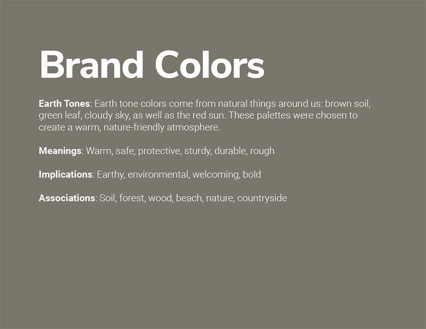
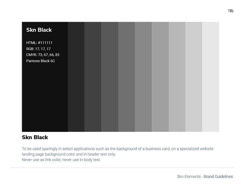
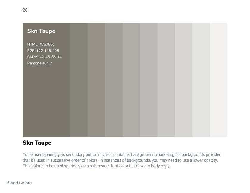
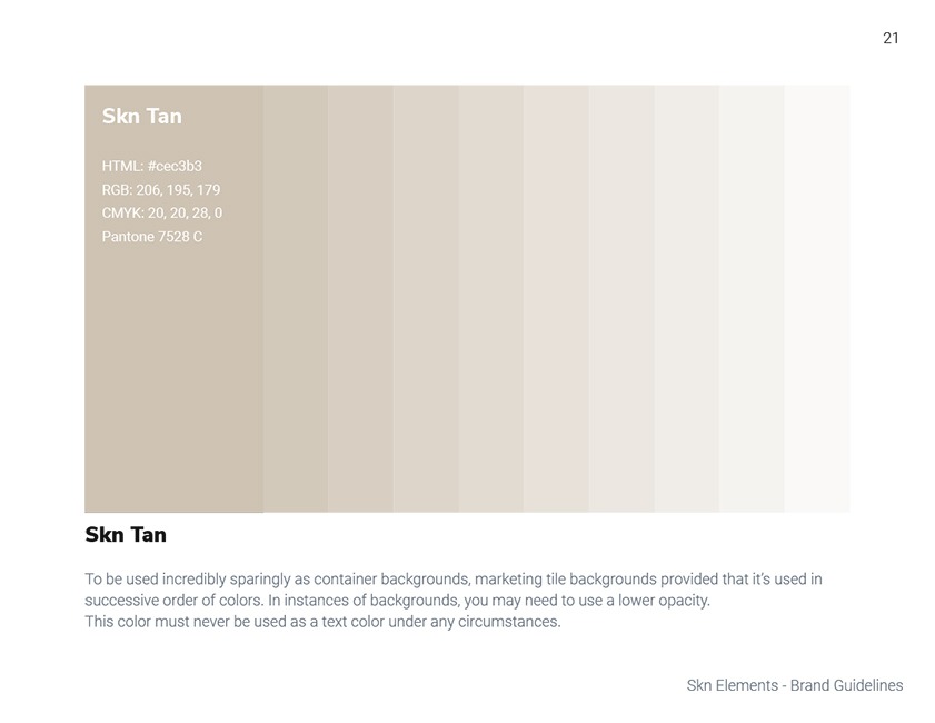
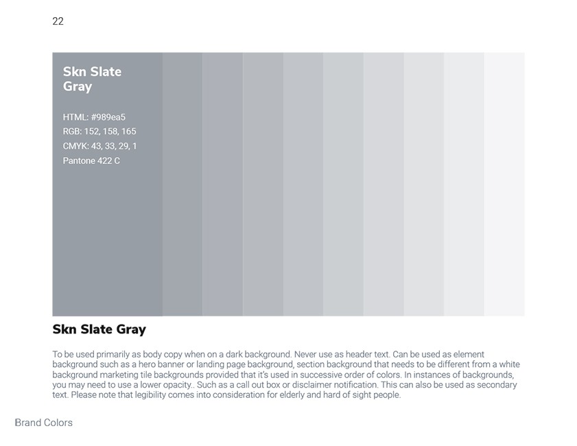
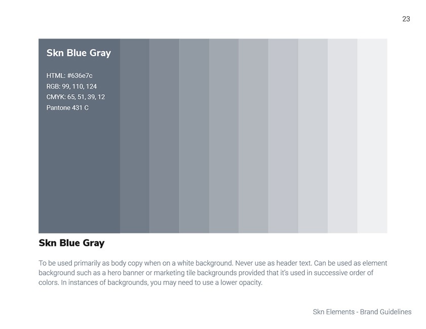
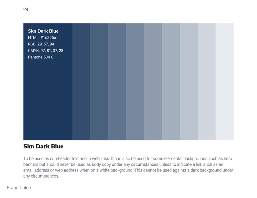
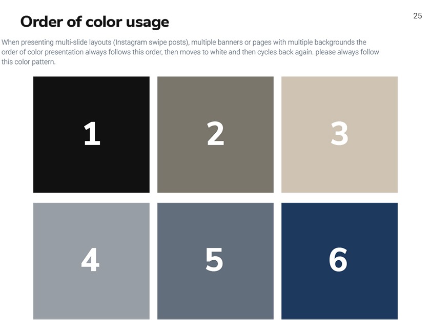
Related to logo design is the color palette. This should also be simple, with only 1 to 3 primary colors (though Google got away with 4). Knowing a bit about the emotions conveyed by certain colors can help you select the right ones.
A lot of color psychology is intuitive, like blue expressing calm and red and yellow expressing passion and energy. Depending on the tint or shade of a color you use, that emotion can be adjusted. A tint is the color mixed with white, making it lighter, and a shade is the color mixed with black, making it darker. A lighter tint of blue conveys tranquility, while a darker shade of blue often conveys trust, an effect that many banks use in their color schemes.
Professional typography
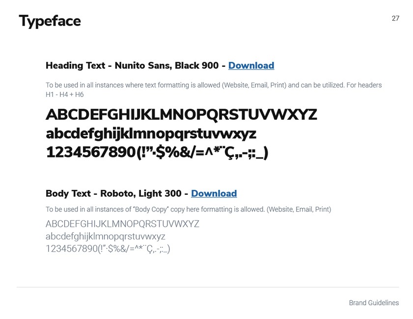
Stressing about finding just the right font may lead others to designate you a “typography nerd,” but you’ll come out ahead when you pick a font that works in harmony with your logo and colors.
Fonts are powerful. The most famous fonts are recognizable even when taken out of context. You’ll want a single primary typeface to lead your brand design, and it should work well with your logo and your color palette. It should also, like your logo and color palette, be simple.

