Landing Pages
When it comes to digital marketing, the landing page usually serves a tool for direct marketing or advertising campaigns. Simply put, a landing page is any web page that a consumer can land on, but in the marketing realm, it’s usually a standalone page, distinct from your homepage or any other page on your website, that serves a single and focused purpose, such as selling a product or capturing a lead.
A landing page is a follow up to any promises that you’ve made in your content, ads or campaigns designd to bring users back to your website and take a specific action (convert). Essentially, it’s the next step toward a visitor becoming a customer. Your landing page lets you make a trade, some sort of special offer, piece of information or a deal, in return for providing contact information.
As opposed to webpages that have embedded goals and encouragement to explore, these pages are designed such that they appear to the fore a clear CTA (Call to Action). This helps in raising the rate of conversion for any campaign that you are working for and assists you in the acquisition of the sale you had your eyes on.
Landing Pages Types
Lead Generation Pages: These pages instill a form to call out to people for action. These forms act as tools to collect data or information from these leads such that they can be contacted later on. The contact information that is sought through these lead gen pages are email addresses. For the hook, freebies are offered such a free download, eBooks, pdf or other. Ecommerce businesses and B2B corporates use this to build their email lists and push conversion through follow up techniques.
Clickthrough Pages: This is a frequent use by SaaS or eCommerce marketers where people tend to go for the purpose of generating sales or acquiring subscriptions. There is usually a plain button that links you towards the transaction and ensures the lead is captured right.
— SO WHAT GOES INTO A HIGHLY EFFECTIVE LANDING PAGE?
Creating a highly converting landing page can be big task. It needs to look good, but it also needs to communicate your message and effectively convert that traffic into new leads and customers. It’s hard enough to drive people to your website — and even harder to keep their attention once they get there. Here are some effective tips to keep people engaged and get them to take the action you want.
01
Keep your layout clean
Nothing drives people away from your website faster than a cluttered layout. Take a step back and look at your design. An effective landing page design makes smart use of color and eye-catching images. Certain button colors such as red or green are said to increase landing page conversions, but above all make sure that there is a strong contrast between your button color and your background.
02
Test Position of forms
Don’t assume that having your form at the top or the bottom of the page will lead to more conversions. In fact, big determinents of conversions and lead capture can be where on the page your forms are placed. Use A/B split testing to try different positioning of your forms on the page. Top left, top right, top center etc. You’ll be surprised to discover how much this can impact your rate of conversions.
03
Keep things consistent
If there’s a disconnect between what the ad promises and the landing page offers, you may as well have a broken URL in your ad. Imagine seeing an ad for the juiciest burger you’ve ever had, only to show up to find a restaurant that only sells Carrots. Making sure the messaging, creative and offers are all consistent is critical (and often overlooked).
04
Give people a reason to share
Include a social media block with all the social sites you’re active on in your design. Encouraging others to share your website on social media is a great way to get the word out. If you have a beta test or product launch , you might consider bumping someone up on a waiting list in exchange for sharing your landing page on their own social media channels.
05
Remove the main navigation.
Once a visitor arrives on your landing page, it’s your job to keep them there. If there are links on the page that enable visitors to move around your site, you run the risk of distracting them and having them abandon the primary goal of conversion. This is called “lead friction”. A term that’s commonly used when exploring conversion optimization.
06
Only ask for the information you really need.
There’s an old saying in marketing when creating forms. “The more you ask for, the less you get.” When you ask for too much information on your lead-gen forms, it’s a turn-off to most people. Try distilling down to just the information you really need and cut everything else away.
07
Definitely use live chat
A lot of marketers say “Forms are dead”. And with a decreasing amount of patience in consumers these days who all want immediate gratification, real-time responses and a person to answer their questions without delay, adding a live chat widget on your landing pages is a sure fire way to convert your customers.
08
Include video
Including video on your landing pages can be incredibly compelling, especially if you’re trying to convey a complex idea without bogging your visitors down with endless amounts of text they’ll never read. Video is also an excellent way to reinforce your overall messaging and branding, and if done well, can be wildly entertaining.
Bonus: Get rid of landing pages all together and start using new ad formats.
This might seem counterintuitive (or downright crazy), but today, there’s actually no real need to force prospects to a landing page at all. there are several new ad formats available to advertisers that eliminate the need for landing pages. Rather than hurting conversion rates, these new ad formats can prove to be even more effective than the traditional funnel approach. Twitter’s Lead Generation cards, for example, allow prospects to take advantage of offers directly from within the ad itself, saving your prospects time and minimizing the steps necessary for the visitor to convert.
Google, Facebook, LinkedIn and other social platforms that offer advertising all offer their own variations of social ads that integrate lead gen forms and pre-populate the forms with the user’s profile information, making conversion as easy as the simple click, without having to ever fill out a form manually.
Why You Need Meta Business Suite and Business Manager for Clients
In today’s hyper-connected world, there are few more effective ways of communicating than through the Meta conglomerate. Within this umbrella organization, monthly active users (MAUs) communicate mainly through three of the major social networks: Facebook: almost three billion MAUs; WhatsApp: over two billion MAUs; Instagram: 1.5 billion MAUs. So when ...
— TOOLS + PLATFORMS
Popular + Useful Tools
Of course you can always build your own landing pages with the help of a developer, but in the meantime, here’s a collection of popular tools and useful platforms (some free and some premium), widely adopted by marketing professionals and business owners around the world, to ensure they can effectively create, manage and analyze the effectiveness of landing pages and the marketing campaigns that lead to them.
Carrd is a platform for building simple, responsive, one-page sites for pretty much anything, whether it’s a personal profile, a landing page with a MailChimp signup form, or something a bit more elaborate. It’s fast, flexible, simple to use, and 100% free. Choose a starting point or start from scratch.
Mailchimp is primarily know as an email marketing platform, but its landing page builder is surprisingly capable and has developed quite a bit over the years as Mailchimp pivots to a full marketing platform. It’s certainly great for collecting email newsletter signups, but you can also sell products by connecting your account to Square.
Turn your ad clicks into conversions with the only landing page platform designed to create, personalize, & optimize post-click landing pages at scale. Unlike other single product solutions on the market, Instapage includes six products and hundreds of features built specifically to help you increase your advertising conversion rates.
Google Sites is a structured wiki- and web page-creation tool included as part of the free, web-based Google Docs Editors suite offered by Google. The service also includes Google Docs, Google Sheets, Google Slides, Google Drawings, Google Forms, and Google Keep. Google Sites is only available as a web application.
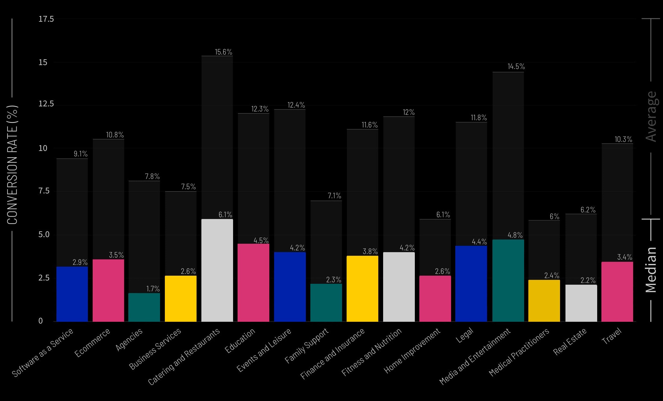
Landing Page Conversion Rates By Industry
Most marketers actually don’t know whether their last campaign was a smash hit—or a total dud. Unlike open and click-through rate benchmarks for email marketing, industry-wide data for landing pages just hasn’t been available.
A conversion can mean many things. It’s an action that you want your visitors to take—like buying, downloading, or subscribing. It can be a new lead, a phone call, or an in-person appointment. But ultimately it depends on your business, campaigns, industry, and goals.
So, what’s a good conversion rate for your landing pages? And why do some pages (and industries) perform better than others? Knowing this helps you continually improve performance, but understanding what success actually looks like can be a challenge.

