

There are many elements to take into consideration when formulating your mobile user experience, but it’s extremely important to keep thumb friendliness top-of-mind.
On desktop devices, users use a mouse to interact with the screen. They can move their mouse to a navigation menu with ease. This is because the mouse does not constrain their wrist movement.
But when users hold a mobile phone, their thumb has a limited range of motion. There are certain areas of the screen they cannot reach. These areas will vary based on which hand they use to hold their phone and the size of the phone’s screen.
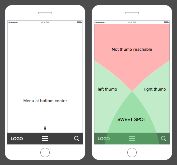
When you place a menu in a hard to reach area, users have to regrip their phone to move their thumb closer. Or, they have to use their other hand to interact with that area. This extra work can make navigating harder and slow down the user’s task…
About the Author: Jeremy Mays

Keep Reading
Want more? Here are some other blog posts you might be interested in.

Did you hear the one about the arsonist handing out smoke detectors? As we all know by now since it’s been ...

Every line in your budget has survived an argument. The $300 seat license got questioned in a comment thread. The $40,000 ...

Two research firms measured marketing leadership this year and published findings that cannot both be good news. In January, Spencer Stuart ...
For founders and growing companies
Get all the tips, stories and resources you didn’t know you needed – straight to your email!