
You only get one chance to make a first impression – and that applies to brands as much as people. For products, packaging, ads, and landing pages are the digital equivalents of introductions and interviews in the human world.
That’s why every design element – including typefaces – must be seamlessly aligned, underpinning recognizability. For consumers to trust your products because of your branding, the entire trade dress of your business must march to the same drummer.
This applies even more to marketing campaigns, battling for the attention of buyers with notoriously short attention spans (think eight seconds!) and dozens of other calls on their attention at any time. So here’s a set of practical hints on how to pick stand-out typefaces for your brand.
Setting the Mood with Font Types
There are basically four typeface categories, each triggering different feelings through specific cultural and emotional baggage.
- Serif fonts have tiny flicks (known as divots) at the end of each stroke, with a classic (and classy) look that makes them perfect for more traditional brands, long-established and often dealing with high-priced wares or serious matters like politics and insurance;
Favorite options include Times New Roman, Garamond, Baskerville, and Georgia, as well as typewriter look-alike Courier New.
![]()
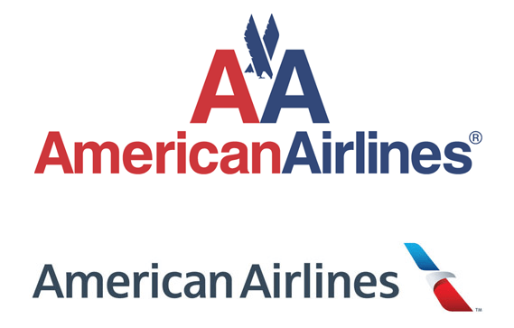
- Sans-serif fonts sport a more modern look, their trim-cornered strokes unencumbered by serif divots. A 2021 study analyzed over a million web pages, finding that over 85% of them use sleek sans-serif fonts for their headers and body texts. This more contemporary look is a top option for brands needing a cool modern feel, like many airlines.
Popular sans serif fonts include Arial, Kalinga, Barlow, and Calibri.
- Slab fonts are chunky, with thick, eye-catching strokes that look both powerful and resistant. That makes them a perfect choice for automobile brands like Honda, conveying durability and reliability.
![]()
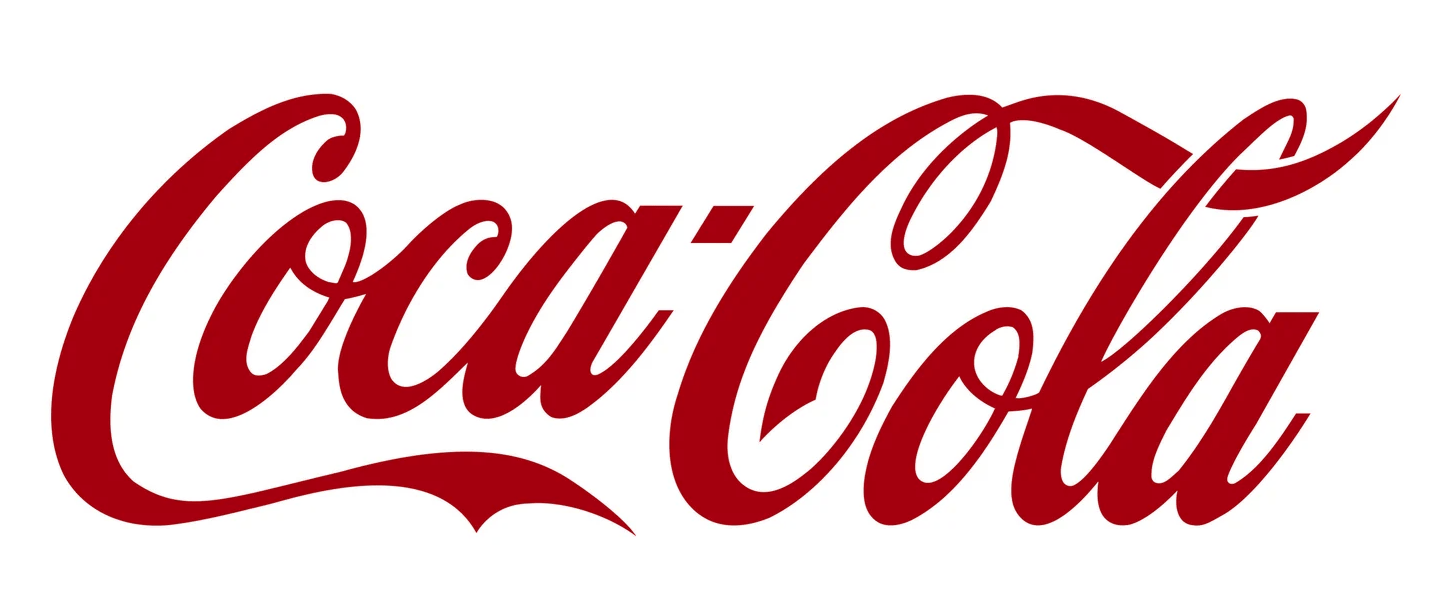
- Script fonts add a touch of old-time elegance, as their connected curvy lettering resembles handwriting. Probably the most famous example is Coca-Cola, followed closely by Kellogg’s and Cadillac.
Communicating With More Than Words
Remember, 90% of the information transmitted to the human brain is visual – and we can process visual information up to 60,000 times faster than text. This means that visitors to your website are making decisions on whether or not to remain on your website before they’ve had time to process a single word.
Having selected a couple of font styles that mirror the company’s image, it’s time to think about size, italics, boldface, small caps, spacing, and kerning. There are plenty of other aspects that are just as important: negative space, color palette, text density, average word, sentence, and paragraph length, reading comprehension, and countless others.
It’s typography that sets the tone and the mood for an entire website. That’s why the layouts of all consumer-facing communications should be condensed into a flexible but homogeneous style guide that mixes and matches endless lettering options.

See how Transmyt can drive massive amounts of growth for your business.
-
SEO – Unlock massive amounts of traffic.
-
Content Marketing – Our team creates engaging content that will get shared + attract customers.
-
Paid Media – Effective paid strategies with clear ROI.
-
Website Development – Cutting-edge technology platforms.
Typefaces Must Match Wares
Loaded with cultural significance, fonts are themed ambassadors that silently tell the world about your company, its products, and its values. From outdoorsy Western to spooky Gothic, typography is the first impression that consumers absorb from your advertising and landing pages.
There’s actually an entire field of study called font psychology, which examines how typefaces affect people’s behavior. In fact, each font has its own ‘personality,’ which is often industry-specific.
This is why many Big Tech companies – like Facebook, Google, and Spotify – go for a colorful futuristic look. Plunging even further into fonts-as-a-business-tool, Instagram launched its own Instagram Sans font in May 2022, blending clean lines with quirky squiggles and squircles.
Landing Pages Are Vital
For landing pages in particular, design elements play a leading role, with typefaces underpinning brand recognition. As a rule of thumb, you should stick to just two typefaces: one for your headers and one for your body text. A popular choice is to use a serif font for headers (using size to differentiate sub-headers) with sans-serif everywhere else.
Hot tip: Individual page templates with built-in style guides streamline website updates with more trustworthy metrics and better brand recognition.
Staying Consistent
If you constantly change typefaces – and the look of your content – customers are less likely to recognize your brand. So pick a cluster of fonts and use them across all your channels and platforms for better (and faster) brand recognition.
As a starting point, your style guide should be based on your main website. If fonts look appropriate and inviting there, then stick to them wherever you can.
Takeaway: Picking the perfect fonts that reflect your brand and reach out to its markets is an aspect of marketing that’s often neglected. One of the earliest steps towards building up an image that’s instantly recognizable across channels, investing time in researching typography is quickly reflected in enhanced brand recognition.
About the Author: Jeremy Mays
Keep Reading
Want more? Here are some other blog posts you might be interested in.
The entire marketing industry runs on a comforting lie: that there is a right way to do this, a set of ...
Every marketing tool you pay for is selling you the same promise: personalize harder. One to one messaging at scale. Dynamic ...
For the past 18 months, the entire marketing and SEO industry has been screaming the same instruction at every business that ...
For founders and growing companies
Get all the tips, stories and resources you didn’t know you needed – straight to your email!