
As much art as science, marketing color psychology explores the meanings behind colors and how much they can drive conversions. Does this mean firms can make more money by simply tweaking their logo and website colors? Let’s find out …
Color Perceptions Vary by Market
In a globalized world, color schemes defining brands and their trade dress must be carefully selected, appealing to people living in many different cultures. By no means universal, colors are emblematic, enriched by age-old traditions.
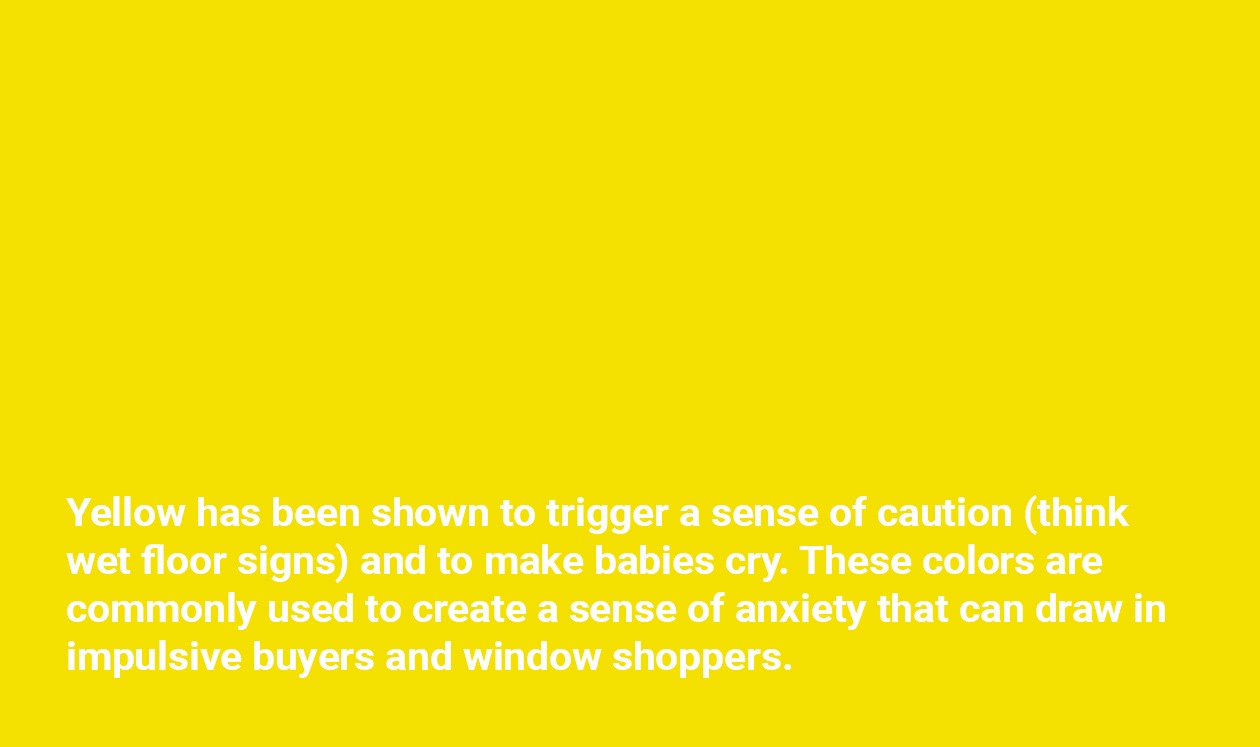
Take yellow, for instance. For people hunkered down during the long dark winters of the Northern Hemisphere, this sunny hue is redolent of warmth and summer. But in hotter countries, yellow can be emblematic of infection and disease (malaria, jaundice). It’s also the background color used for poison and hazard warnings.
Different Strokes for Different Folks
Another factor that shapes color preferences is gender. Surveys have shown that both men and women like blue, red, and green, with blue, ranked as a universal favorite. Orange, lime, and yellow are perceived as cheap, with peaks and purples favored by women. While accepting neutrals (black, grey, and white), men are drawn to bright shades more than women. However, women have a sharp eye for even the subtlest shift in shades and appreciate evocative names that spotlight these differences. But for more straightforward men, moss, emerald, jade, and apple are all simply green!
Older people tend to dislike orange, while brown is generally despised. In fact, a repugnant shade of sludge was the key factor that turned a deeply negative project – designing cigarette packs that would discourage smoking in Australia – into an all-time marketing success story. Underpinned by a brilliant campaign, Britain’s GfK BlueMoon agency set out to discover ‘the world’s ugliest color’. Having garnered vast amounts of editorial coverage, the drab ‘winner’ was announced in 2012: Pantone 448 C. This muddy brown (aka ‘opaque couche’) was rated as so repulsive that even recalcitrant smokers would consider quitting, instead of buying these unbranded packs.
Well aware that colors play important roles in branding and marketing, smart marketers start out by asking:
- What’s the core message conveyed by a brand?
- What are the goals of its marketing activities?
- Is this color combo appropriate for the product or service?
- Does it appeal to its buyers and/or users?
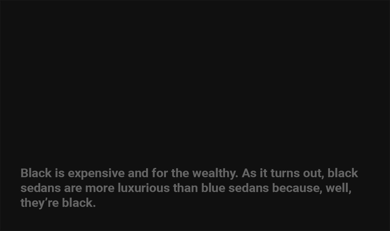
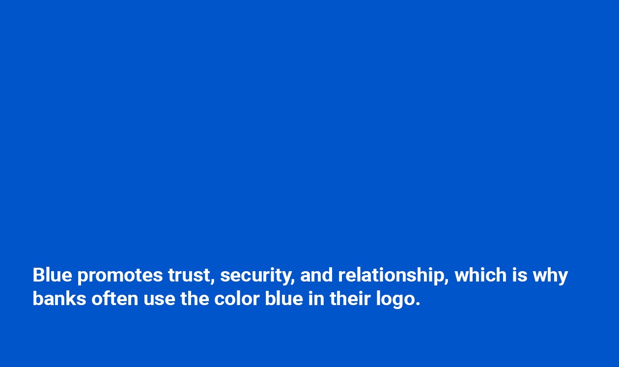
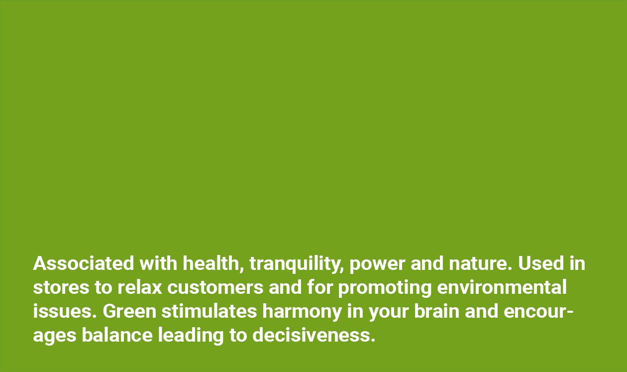
It’s important to remember that only a few colors convey reasonably universal messages. Blue recalls clear skies and calm seas, symbolizing wisdom and infinity. Green tends to represent nature and tranquility. Red is an attention-grabber with positive connotations (warmth, luck), but also reflects anger. Black and white tend to be ambiguous: although elegant and sophisticated, they also symbolize purity, death, and mourning.
Color Blending for Effective Branding
Experienced brand designers devote much time and attention to creating customized color harmonies, preferably using the Adobe color wheel. Ideally, they should select three colors forming an equilateral triangle on the field, with at least one cool and one warm color. This triadic color scheme works best with primary colors for optimum vibrancy, as secondary and tertiary shades may result in murky, jumbled presentations.
![]()
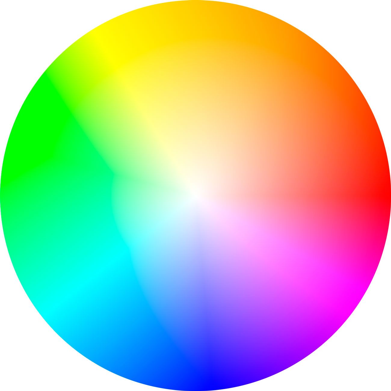
Color is a web app and creative community where you and other artists can create and share color themes and inspiration. Save themes to your Adobe Creative Cloud Libraries to use in your favorite desktop and mobile apps, like Adobe Photoshop, Illustrator, and Photoshop Sketch.
The most common palette options are:
- Monochromatic ranges within a single color (cobalt, indigo, sapphire);
- Analogous palettes that use neighboring tones (strawberry, mango, grapefruit)
- Complementary combos that pop, with warm and cool colors drawn from three points on the wheel (teal, magenta, gold).

See how Transmyt can drive massive amounts of growth for your business.
-
SEO – Unlock massive amounts of traffic.
-
Content Marketing – Our team creates engaging content that will get shared + attract customers.
-
Paid Media – Effective paid strategies with clear ROI.
-
Website Development – Cutting-edge technology platforms.
Tips on Choosing Colors that Boost Sales
Here are seven color marketing tips on how to pick the best colors for boosting sales on specific markets.
Tip # 1 Always use colors that appeal to your targeted audience segments: age, nationality, interests, education, income, and even pronoun preferences;
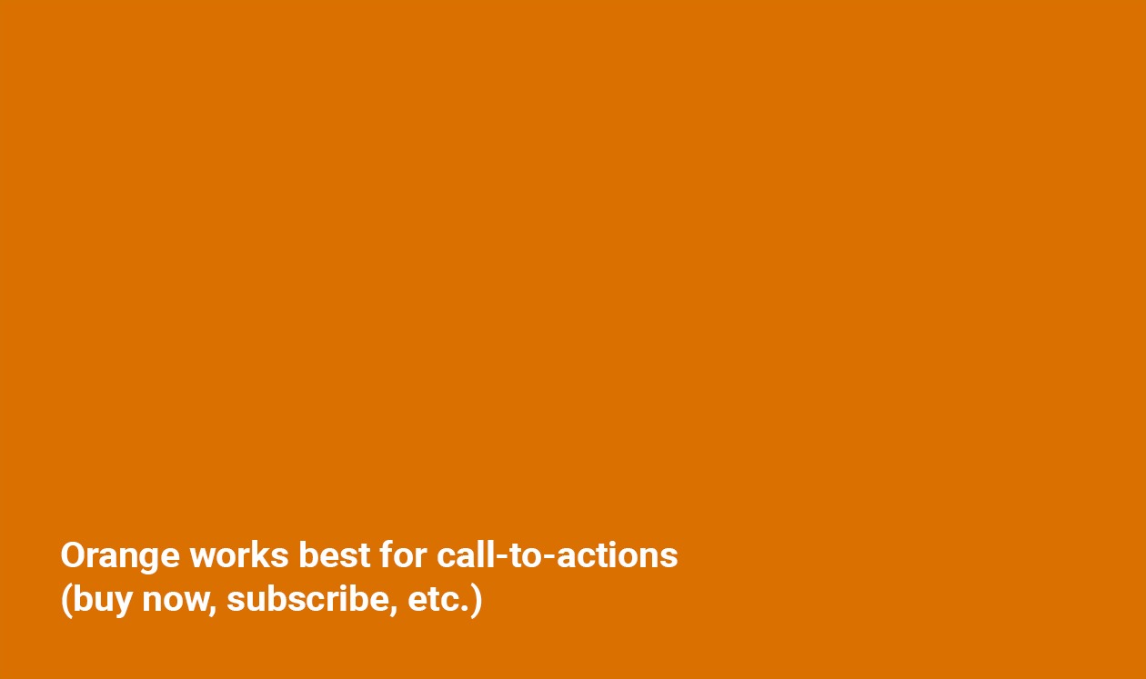
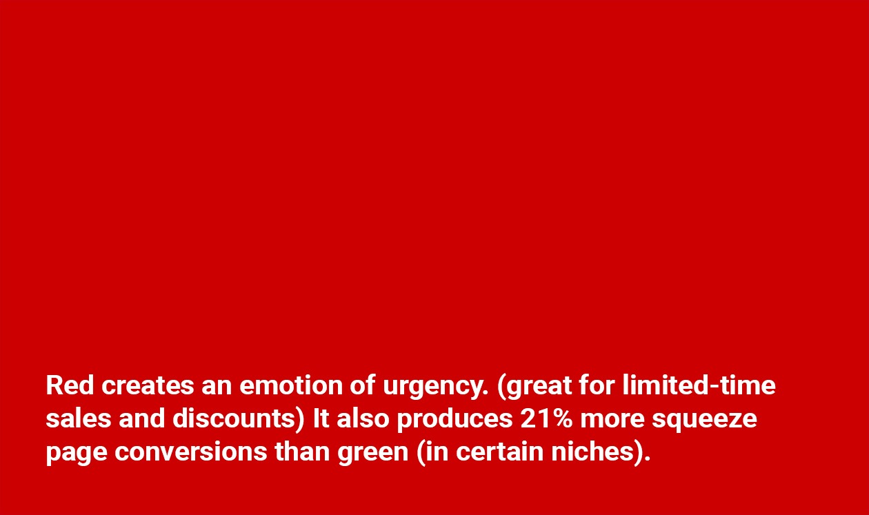
Tip # 2 Match headline colors to the message: urgent Flash Sale! reds, environmentally responsible greens, trustworthy blues for warranties and loans;
Tip # 3 For easy reading, keep contrasts strong between backgrounds and lettering: yellow shows up poorly against white, while dark fonts are hard to read against maroon, navy, moss, and charcoal shading.
Tip # 4 Standardize (and document) a color and font hierarchy that steers visitors intuitively through websites and other content: this is Important; here are some details; this is Interesting; now do THIS!
Tip # 5 Opt for one dominant color (80%), splitting the remaining 20% between the accents, and adjusting saturation for the most striking results;
Tip # 6 Add glamor with gold, silver, pewter, and bronze pigments, particularly for sparkling up the packaging for luxury or aspirational products featured in close-up photographs;
Tip # 7 Run color combo tests for each webpage and keep track of conversions, tweaking depth and saturation until the metrics peak.
Data-Driven Evidence
Way back in 2006, researcher Satendra Singh conducted a study that explored the impacts of color on marketing. Its findings suggested that sensitive use of colors helps differentiate goods from their competition, while also influencing feelings and moods (positively or negatively). For brand managers, his conclusions are vital, showing that:
- only ninety seconds are needed for people to form opinions about products;
- some 62% to 90% of these assessments are based only on colors.
Remember: you only have one chance to make a memorable first impression!
Color Marketing Psychology Takeaways
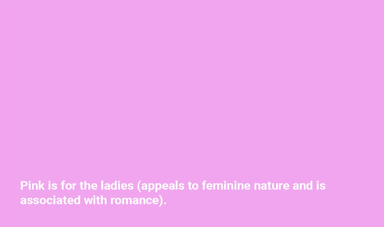
When a color is ambiguous (does red indicate danger, anger, or love?) its intent should be clarified through words and images: a strikeout, a flame, or a rose. Its more delicate cousin, pink is not necessarily just girly – it’s also emblematic of youth, spring, and new beginnings.
Use contrast to draw attention to important messages, particularly calls to action. Warm shades tend to be more eye-catching, with hot orange offering top pop value in complementary color schemes. In counterpart, analogous tones from the cooler end of the spectrum are effective for conveying experience, expertise, and confidence. Monochrome layouts are the perfect way to identify and promote specific product lines.
Finally, expert web designers are well aware that their most effective tool is also the simplest: blank space. Clean, cool, and uncluttered, plenty of white areas invite prospective buyers to browse and explore, edging them gently along the sales funnel. In the words of world-famous architect and designer Mies van der Rohe: Less is more!

Want more insights?
Subscribe to our weekly marketing tips and advice, delivered straight to your inbox.
Oops! We could not locate your form.
About the Author: Jeremy Mays
Keep Reading
Want more? Here are some other blog posts you might be interested in.
Every marketing tool you pay for is selling you the same promise: personalize harder. One to one messaging at scale. Dynamic ...
For the past 18 months, the entire marketing and SEO industry has been screaming the same instruction at every business that ...
Every quarter, somewhere in a B2B company, a marketing team sits down and says the same thing: "Nurture is underperforming. We ...
For founders and growing companies
Get all the tips, stories and resources you didn’t know you needed – straight to your email!