
There are many elements to take into consideration when formulating your mobile user experience, but it’s extremely important to keep thumb friendliness top-of-mind.
On desktop devices, users use a mouse to interact with the screen. They can move their mouse to a navigation menu with ease. This is because the mouse does not constrain their wrist movement.
But when users hold a mobile phone, their thumb has a limited range of motion. There are certain areas of the screen they cannot reach. These areas will vary based on which hand they use to hold their phone and the size of the phone’s screen.
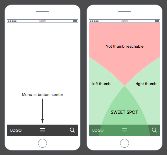
When you place a menu in a hard to reach area, users have to regrip their phone to move their thumb closer. Or, they have to use their other hand to interact with that area. This extra work can make navigating harder and slow down the user’s task…
About the Author: Jeremy Mays
Keep Reading
Want more? Here are some other blog posts you might be interested in.

KPIs can create clarity or they can create chaos. This masterclass shows you how to spot vanity metrics, proxy traps, and metric gaming, then choose a small set of KPIs that drive real behavior, real accountability, and real outcomes.

You open LinkedIn to check one thing. One message. One comment. A quick scan before you go back to real work. ...

The best founders disappoint people quickly by saying no, cutting scope, and keeping promises. Learn how to build focus, avoid scope creep, and ship work that earns trust.
For founders and growing companies
Get all the tips, stories and resources you didn’t know you needed – straight to your email!